Nike
Store Performance Reporting App
The What
The Store Performance Reporting (SPR) app is used by 6,000 Nike Store employees, worldwide.
It can be accessed on an iPad or Desktop.
It’s used primarily by store Head Coaches to track the performance of their respective stores. It’s also used to track the performance of store employees (athletes).
Depending on the role, a user can also track multiple stores within their region.
The Why
The recommendation was to build a homegrown version of SPR because the current one was built by a third party vendor which was lacking in user experience and also very expensive.
It was important to involve me in the rebuilding process to ensure the user's input was heard and the design followed the Nike Podium Design System standards and UXD principles.
Design the app so that it’s far more than just dashboards. Incorporate ML and AI to assist Coaches in making more strategic decisions on store performance.
Discovery and Research
Before doing any ideation or wireframes, myself and my partners in Product and Design Ops scheduled and participated in user interviews with Nike Store Head Coaches. Our goal for these interviews was to identify what they liked and disliked about the current SPR app and uncover friction points. It was also an opportunity to gain more understanding of how they use the app in their daily routine.
What we learned
We interviewed a total of 5 Head Coaches. Some of the more interesting things we learned were:
The app wasn’t very performant and as a result, they couldn’t use it on an iPad. They were only able to access it on a desktop computer.
Some of the coaches used the ‘Huddle’ functionality and others rarely if ever used it.
None of them were given any formal training or documentation on how to use the app.
The common usage of acronyms made it difficult for the coaches to understand the data they were looking at.
Using feedback with the initial round of interviews, I designed a clickable prototype which was used for our first round of user testing.
We tested 3 coaches; 1 back of house and 2 head coaches
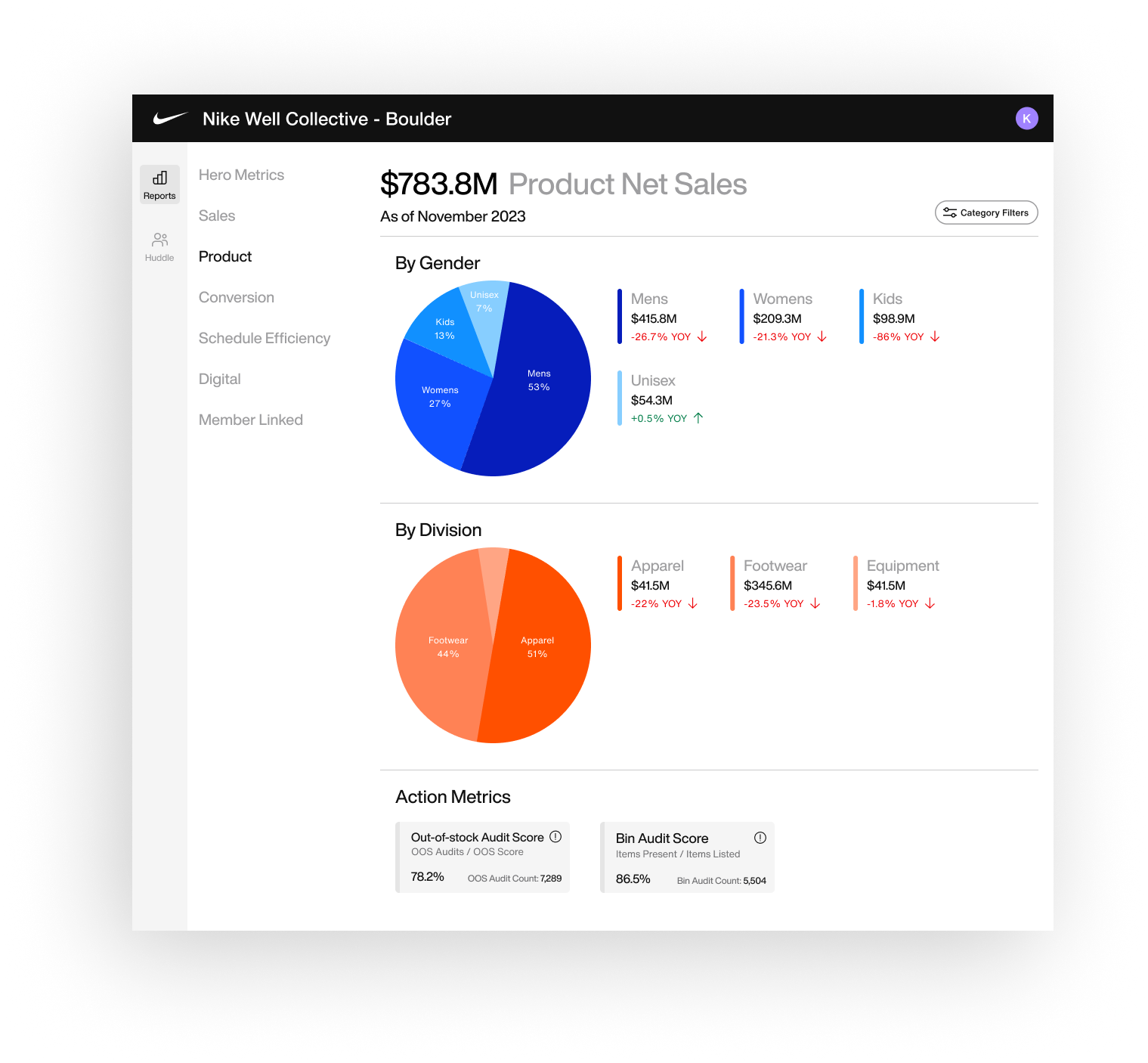
Before
The existing app had a lot of issues with regards to the user experience and usability, in general. The primary reason for that was because there wasn’t any user input when it was built. In addition, the performance was very slow and would always freeze the user’s iPads. Lastly, it used Tableau for the front end which really limited what the engineers could do with it in terms of UI customization, which meant they couldn’t utilize Nike’s Podium Design System.
Ideation
Using the Nike Podium Consumer Style Guide, I began conceptualizing how the new app would look. During this process, I worked closely with my Product and Design Ops partners to solicit feedback and keep them in the loop.
First draft of Product Sales page
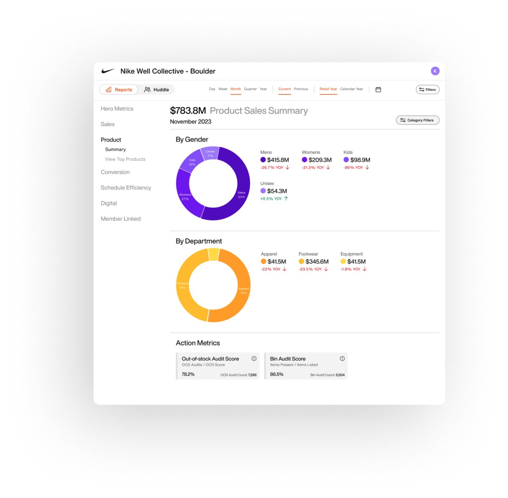
Refinements to Product Sales & Conversion Rate pages
First draft of Conversion Rate page
Refinements to Filter Options
Refined Prototype
Takeaways from User Testing
Mobile vs Desktop version
The mobile version is not only convenient but also crucial for high touch coaching conversations or decisions to optimize the store due to its portability.
Accuracy of action metrics
Ensuring the accuracy of action metrics is important, as it sometimes differs from other tools that coaches use. Having real-time data for action metrics would be beneficial, enabling coaches to make real-time decisions to optimize store and Athlete performance.
Additional Metrics
Users would like to see additional metrics such as:
BOPIS (buy online, purchase in store) orders vs orders ready
BOPIS cancellation reasons
Graph out the Schedule Efficiency
Differentiate four wall transactions vs total
Membership linked percentage without SFS (Ship from store)
Inventory Metrics


